As part of Colour Blind Awareness Day 2018 I thought I would share my experiences. I first discovered I was colour blind at the age of 7 while in class at primary school, looking at a chalkboard and struggling to read the yellow writing. After this incident I went to have my eyes checked and sure enough, I was diagnosed as colour blind.
So what is colour blindness? Colour blindness affects 1 in 12 males and 1 in 200 women. Until recently, I had believed that colour blindness only affected men as this was the common belief when I was growing up. But we now know that even though it is a lot less common for women, they can also suffer from this type of visual impairment.
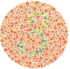
 The classic colour blindness test can be carried out using Ishihara plates. If you can’t see the number 3, then you’re probably colour blind.
Attitudes, awareness and the development of colour blindness friendly software has changed a lot since I was first diagnosed. But is it enough?
When you are building a website or designing a plugin, there are 3 types of colour blindness that will need to be taken into consideration:
Red-Green Colour Blindness
This is the most common form of colour blindness which is split into 4 types:
⦁ Protanomaly: Red, orange, and yellow appear greener and colours are not as bright.
⦁ Protanopia: Red appears as black. Certain shades of orange, yellow, and green all appear as yellow.
⦁ Deuteranomaly: Yellow and green appear redder and it is difficult to tell violet from blue.
⦁ Deuteranopia: Sees reds as brownish-yellow and greens as beige.
Blue-Yellow Colour Blindness
Blue-yellow colour blindness is rarer than red-green colour blindness. This is split into 2 types:
⦁ Tritanomaly: Blue appears greener and it can be difficult to tell yellow and red from pink.
⦁ Tritanopia: Blue appears green and yellow appears violet or light grey.
Complete Colour Blindness
People with complete colour blindness (monochromacy) don’t experience colour at all and the clearness of their vision (visual acuity) may also be affected. These are split into 2 types:
⦁ Cone monochromacy: Have trouble distinguishing colours as the brain needs to compare the signals from different types of cones in order to see colour.
⦁ Rod monochromacy or achromatopsia: Rare and the most severe form of colour blindness. People with rod monochromacy see the world in black, white, and gray.
(Information from National Eye Institute (NEI)
Personally, I have Deuteranopia. But colour blindness varies from person to person and can be present in different levels and have varying effects.
Over recent years WordPress have really upped their game concerning colour blindness accessibility with the Make WordPress Accessible project and the inclusion of the A11Y Project.
The A11Y Project is a must for any web developer as it doesn’t just cover WordPress, but can also be used to improve accessibility for all websites. The project has an abundance of resources, material and help to assist in making the internet accessible to all.
Here at UpdraftPlus we use these tools so our plugins are accessible to everyone. One great tool that we have used for colour clarity is the tanaguru contrast finder. By inserting the HEX of a colour we want to use, it allows us to determine if the selected colour is compatible and recommend alternatives if not.
Despite working for UpdraftPlus for several years, it was only around a year ago that I discovered that our brand colour was orange as due to my colour blindness I had always thought it had been red! Luckily it doesn’t hinder my ability to see other text and images that are used within the colour scheme and hasn’t hindered my use of the products.
This does however show the importance of why developers and designers must all take the time to use features like A11Y and other accessibility tools, so that all plugins, websites and apps are accessible for everyone.
Excellent article. i was not aware of the a11y project – what a great resource.
I bang the accessibility drum constantly and drive my colleagues mad. I talk about the fact that websites are often designed by the 20/20/20’s (twenty-somethings with 20/20 vision.)
My impairment is soon-to-be-fixed cataracts. With that in mind, Updraft please run this page through the Firefox WCAG extension, and see how difficult some of it is to read for people with visual impairment. Even this comment box uses grey on grey. I can barely read what I am typing.
I have to agree with Paul.b’s comments. As I was reading the article on color blindness, it struck me that the tangerine font used for links and the gray font used for the article were both hard to read with the white background.